Political Parties and U.S. House -- Who Needs Data Visualization? (#5)
Dec 10, 2014
In my last post we looked at using a table, instead of a graph, to present a more complete, precise, and arguably understandable picture of how the composition of the U.S. House and the president’s party interrelate. And we were still able to take advantage of data visualization! This time, let’s take a look at using one of the most powerful tools in the quantation arsenal – the humble ratio – to really get a message across.
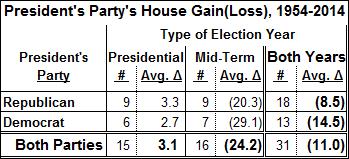
The ratio we’ll use is an average. In the table below is the average change in the number of members of the president’s party in the House, for elections from 1954 to 2014:

This tiny table tells a powerful story: in the fifteen presidential election years, the incumbent president’s party shows an average gain of 3.1 seats in the House, and a loss of 24.2 in the sixteen mid-term elections. Even the biggest numbers-phobe can grasp the difference between plus-3.1 and minus-24.2. And all this took up less than one-fourth the space of any of our previous efforts, even with the counts in the “#” columns, which aren’t critical but do serve to show the sample sizes.
This example illustrates the power of ratios, or metrics, or key indicators, or KPIs, or whatever you choose to call them. In a small amount of space and with great precision, you can tell an audience what they need to know, whether these ratios are presented by themselves or accompanied by the raw data. Graphs and other data visualization techniques can be extremely effective as well, but only when they’re used thoughtfully and sparingly.
But wait, we’re not quite finished. What accounts for the huge difference between presidential and mid-term election results? Perhaps the mid-terms are the purest statement about the incumbent president – they’re not muddied up by the electorate’s opinion of the other guy running (or other guys, if the incumbent isn’t running again). If so, this pure statement is overwhelmingly negative – large House losses are the norm in mid-term elections for both Democrat and Republican presidents. So not only are we a fickle electorate, but a grouchy one!
This fickleness deserves a further look, which we’ll address in the next post. In that one, we’ll look at another quantation technique: recharacterizing the data.
“Painting with Numbers” is my effort to get people to focus on making numbers understandable. I welcome your feedback and your favorite examples. Follow me on twitter at @RandallBolten.
Other Topics


