

Investing in U.S. Stocks: An Irrefutable Table
Dec 15, 2015
The last post was about the S&P 500 over nearly 100 years, as a great example of using data visualization. Graphs work when there’s way too much data to understand from a table, and what we’re really interested in anyway is the overall trend and amount of variability. Here’s that graph again:
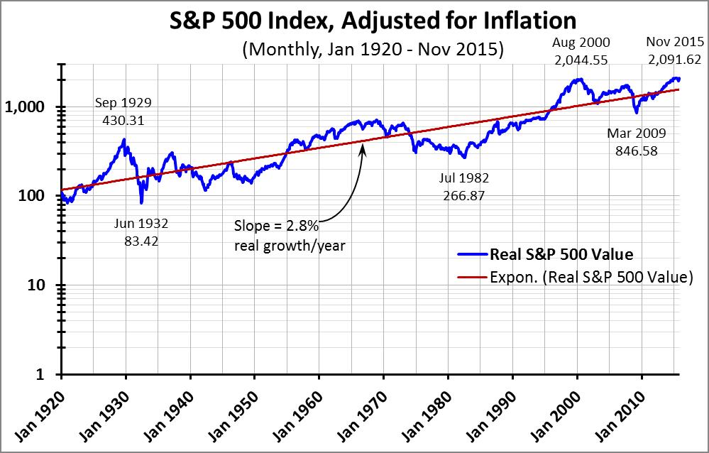
The overall trend over a very long period of time is strongly upward, even when you adjust for inflation. (And as I mentioned last time, this is a price index, which doesn’t factor in dividend yield; dividend yields over the last 95 years have added an average of an additional 4.0%/year for the stocks in the S&P 500.)
This is a strong message… that even the average investor can do nicely by investing steadily in the U.S. stock market. But not strong enough – a nice return on average is all well and good, but it’s no guarantee when you need that money for your retirement, and that average may include both big winners and big losers in a volatile stock market. So let’s take a different look, to understand the risk and uncertainty. We need to:
- Choose an objective. I chose a return that at least beats inflation, preferably on a pure stock price basis but at the very least when we include a dividend yield.
- Choose an investment strategy. Invest an equal amount each month for a period of years.
- Choose a time horizon. While we have 95 years of data, most investors only need to focus on investment periods ranging up to 40 years. So let’s look at a series of time horizons, starting each month from Jan 1920 on. For example, since Jan 1920 there have been 791 30-year periods; the first began in Jan 1920, the second in Feb 1920, and the last (so far) in Nov 1985.
The most straightforward way to analyze all this is to use a table rather than a graph, like the one below:
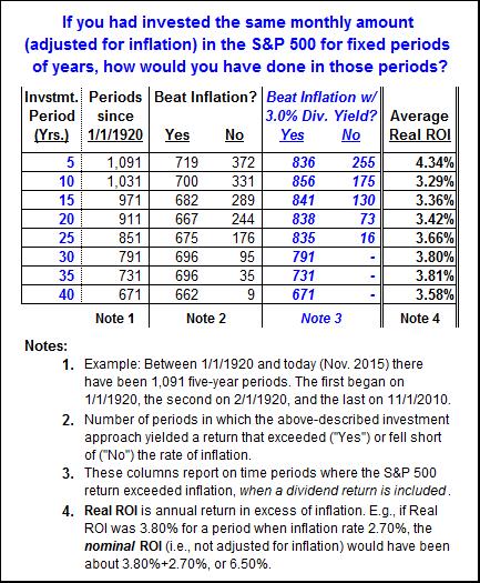
Even if your time horizon is only 5 years, the odds are good: of the 1,091 such periods in our database, you beat inflation 66% of the time on a price basis alone, and 77% of the time if you include a 3% dividend yield. And it gets better if you stay with it longer: Over the last nearly 100 years, in EVERY period of 30 years or longer the return on the S&P 500, including dividend yield, outpaced inflation.
We’ll conclude with a few observations about the design of this report:
- The words matter. Although the table itself is pretty simple, the concepts behind the report are complex. For a report like this, it’s helpful to have the report’s objective clearly set out in the title, and use footnotes to clarify the numbers.
- The objective and the key results are emphasized. The descriptive title of the report and the key metric – how often stock appreciation plus dividends exceeded the inflation rate – are set out in boldface blue type.
- The AVERAGES still matter. Although the main purpose of this report was to assess how much risk there is in investing in the U.S. stock market, the right-hand column brings the reader back to the overall expected results. It shows that for any of the investment periods from 5 years to 40 years, the average performance exceeds inflation by well over 3%/year, not including dividend yield.
I like this report because it’s a good example of quantation, but it serves an important purpose: Even when you factor in ugly surprises like Black Monday 1987 and the crash in 2008, the stock market is a pretty sure thing when you allow time to run its course. The alarmists about stock market risk are doing a huge disservice to the American worker.
“Painting with Numbers” is my effort to get people to focus on making numbers understandable. I welcome your feedback and your favorite examples. Follow me on twitter at @RandallBolten.
Other Topics