

Social Security's Determined March
Apr 30, 2012
In recent weeks, I’ve promised that some future posts will discuss both Social Security and general U.S. government spending. In this post we’ll do both, as we take a look at trends in Social Security payments. First, let’s look at total dollars of Social Security payments historically from 1970 and projected through the year 2022 (the blue bar divides historical results from projections, and the source for this information is the generally reliable Congressional Budget Office):
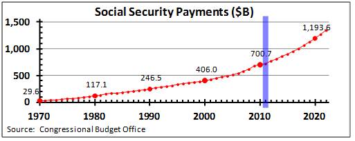
At first glance, the increase from $29.6 bilion in 1970 to nearly $1.2 trillion in 2020 seems astounding — a forty-fold increase in just 50 years! But it’s not quite that astounding, because while Social Security was growing, so was the U.S. economy. And some of that increase is just due to inflation: even though inflation has only averaged about 2.5% per year over the last 20 years, all that still adds up — and it averaged more than 6% in the 20 years before that. So instead of looking at the raw dollars, let’s instead look at Social Security payments as a percentage of Gross Domestic Product (GDP) — in other words, how much of the total spending in our economy went to Social Security:
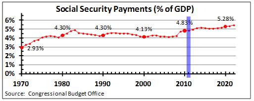
You can break the above time horizon into three main periods:
All this is especially critical because as the trustees of the Social Security Trust Fund reported (see my last week’s post on this), there is an increasing gap between Social Security payments and contributions from employees and employers. The shortfall must ultimately come from either tax increases, increased employee/employer contributions, additional federal debt, or reduced spending elsewhere. Whatever your policy preferences, this is something to take seriously, but first these graphs help us to understand the magnitude of the issue clearly.
“Painting with Numbers” is my effort to get people talking about financial statements and other numbers in ways that we can all understand. I welcome your interest and your feedback.
At first glance, the increase from $29.6 bilion in 1970 to nearly $1.2 trillion in 2020 seems astounding — a forty-fold increase in just 50 years! But it’s not quite that astounding, because while Social Security was growing, so was the U.S. economy. And some of that increase is just due to inflation: even though inflation has only averaged about 2.5% per year over the last 20 years, all that still adds up — and it averaged more than 6% in the 20 years before that. So instead of looking at the raw dollars, let’s instead look at Social Security payments as a percentage of Gross Domestic Product (GDP) — in other words, how much of the total spending in our economy went to Social Security:
You can break the above time horizon into three main periods:
- From 1970 to the early ’80s, payments grew significantly, from 2.9% of GDP to more than 4%, as more and more people retired who had been paying in to Social Security for their entire careers.
- From the early ’80s until about 2008, Social Security payments stayed steady at slightly over 4%, as the additional retirement costs were absorbed by a growing economy and the huge number of Baby Boomers staying in the workforce. From 2008 and into the future, we see another round of significant increases, to nearly 5.5% of GDP projected for 2022, as Baby Boomers start to retire and as life expectancy continues to increase. (In fact, the trustees of the Social Security Trust Fund forecast payments to exceed 6% within another 10-15 years).
- This % of GDP graph isn’t quite as striking as the raw dollars graph, but we’re still talking about a whole lot of money. To put these numbers in perspective, just 1% of the GDP of a $15 trillion economy (that was U.S. GDP in 2011) is $150 billion. To put all this in further perspective, for a federal government averaging spending of about 20% of GDP — that’s the pre-recession average — Social Security is now one-fourth of government spending. And every additional 1% of GDP spent on Social Security increases government outlays by 5%.
All this is especially critical because as the trustees of the Social Security Trust Fund reported (see my last week’s post on this), there is an increasing gap between Social Security payments and contributions from employees and employers. The shortfall must ultimately come from either tax increases, increased employee/employer contributions, additional federal debt, or reduced spending elsewhere. Whatever your policy preferences, this is something to take seriously, but first these graphs help us to understand the magnitude of the issue clearly.
“Painting with Numbers” is my effort to get people talking about financial statements and other numbers in ways that we can all understand. I welcome your interest and your feedback.
Related Blogs
Other Topics
Other Topics