

Marital Infidelity and Data Visualization
Jun 6, 2015
Let’s discuss the fun subject of marital infidelity, and how it’s affected by the husband’s and the wife’s relative income. How a recent study was reported illustrates how numbers – and especially graphs – can be presented to reflect a certain point of view or agenda, often in subtle ways.
Here’s a graph from a Washington Post article about a study by Christin Munsch of the University of Connecticut, on marital infidelity in 2,800 married heterosexual couples:
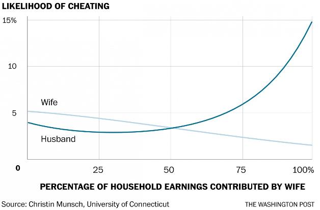
The Post’s writer uses this graph to argue that “the couples with the least infidelity were those in which both people were earning the same amount.” Does the graph support that assertion? I’ll get back to that, but first, just out of curiosity I thought I’d take a look at the original Munsch study, in the American Sociological Review. It is long and scholarly, but it includes the following graph:
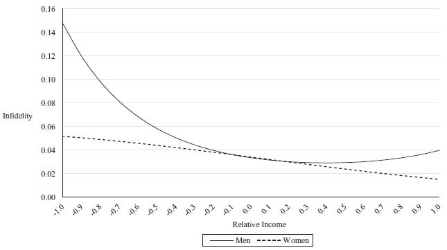
Do these graphs look the same to you? Look closely. The answer: Yes, they are the same graph. The Post’s graph shows the wife’s earnings along the X-axis, while the original graph shows “Relative Income” along the X-axis – for the plots of both men and women, data points where that spouse earns zero are at the left edge, and data points where that spouse earns all the marital income are at the right. So the plots for women are the same in each graph, but the plots for men in the two graphs are mirror images of each other.
Munsch argues a different conclusion from the assertion in The Washington Post. She observes that:
- Women’s infidelity decreases steadily as their share of the contribution to marital earnings increases.
- Men’s infidelity also decreases steadily with share of income until they are earning about two-thirds of total marital income (i.e. Relative Income = 0.33), and then – unlike for women – it starts to increase! (Note that infidelity among men contributing little or nothing to marital income is particularly high. I have no further comment on that, but I’m sure we can all think of something witty to say about it.)
- My additional observation: the original graph shows that at all levels of the contribution to total marital income, men have higher levels of infidelity. Again, I offer no further comment.
Much of Munsch’s text goes on to speculate about the reasons behind these results. There is much on dependency, but little on equality, as suggested in the Post.
In other words, these two graphs show the subtle ways that the presenter’s point of view and agenda can affect numbers presentation choices. That’s especially true with graphs.
Moreover, the Post writer’s assertion is not supported by the graph. While the two curves do happen to cross at the 50% point, the total amount of infidelity (men + women) is roughly the same over a very wide range – from about 25% to 75%. It is only at the edges – women’s contributions of 0%-25% and 75%-100% -- that the total amount of infidelity is higher, and the man’s infidelity is the principal contributor at each edge.
“Painting with Numbers” is my effort to get people to focus on making numbers understandable. I welcome your feedback and your favorite examples. Follow me on twitter at @RandallBolten.Other Topics