

The Humble Bar Graph
May 27, 2012
The law firm of Fenwick & West publishes an excellent quarterly report on venture capital financing activity. Their most recent report provides an opportunity to ponder how even modest changes in how information is presented graphically can make a big difference in how meaningful the information is to the audience.
Below is the report’s graph showing, by quarter, venture financing round investments and labeling the investments as “up rounds,” “flat rounds,” and “down rounds.” [NOTE: I’ve modified the data values significantly in order to make my point more clearly. To see the correct values for the data - as well as the entire original report - click here.] This information is important to those who follow venture-backed startup activity, since it tells us how many follow-on financing rounds for startup companies are financed at increased company valuations.
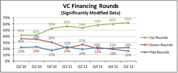
All in all, a pretty good graph. I particularly like the choice of a green line for up rounds and red for down rounds, consistent with the “stop” and “go” (or bad and good) connotation of red and green from our experience with traffic lights. And all the information is clearly marked and readable.
Even so, the graph is hard to read, for the following reasons:
Now consider the following “stacked bar” graph, which presents exactly the same data:
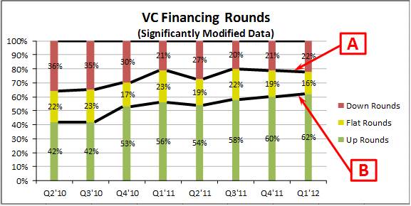
The stacked bar format, which tops out at 100% every quarter, gives the reader the sense that he is looking at the whole enchilada. This choice also enables the reader to get a sense of combined results – i.e., up rounds plus flat rounds, or flat rounds plus down rounds. The line marked “A” above gives the reader a sense of the trend in down rounds, but also of the trend in up rounds plus flat rounds, and the line marked “B” does the same for both the trend in up rounds and the trend in flat rounds plus down rounds.
The series lines connecting each of the bars help the reader get a sense of whether the numbers are getting larger or smaller from quarter to quarter – even for the down rounds and flat rounds numbers, which don’t start from the same point along the vertical axis. Also, the flat rounds series sits between the down rounds and the up rounds series, which is where it belongs in the continuum of the reader’s mind. That view is reinforced by the choice of yellow (rather than blue) for the flat rounds results, completing the red/yellow/green traffic light metaphor.
As is often the case with quantation, small, subtle changes in the way information is presented can have a significant impact on the comprehensibility and the meaning of the information. That’s true for both tables and graphs.
“Painting with Numbers” is my effort to get people talking about financial statements and other numbers in ways that we can all understand. I welcome your interest and your feedback.
Below is the report’s graph showing, by quarter, venture financing round investments and labeling the investments as “up rounds,” “flat rounds,” and “down rounds.” [NOTE: I’ve modified the data values significantly in order to make my point more clearly. To see the correct values for the data - as well as the entire original report - click here.] This information is important to those who follow venture-backed startup activity, since it tells us how many follow-on financing rounds for startup companies are financed at increased company valuations.
All in all, a pretty good graph. I particularly like the choice of a green line for up rounds and red for down rounds, consistent with the “stop” and “go” (or bad and good) connotation of red and green from our experience with traffic lights. And all the information is clearly marked and readable.
Even so, the graph is hard to read, for the following reasons:
- The down rounds and the flat rounds lines are jumbled together, and it’s hard to make inferences from visual inspection. (The up rounds line happens to be visually separate, making that line’s trend easily visible, but that’s simply an accident of the data.) In the legend, the order the lines are presented is “Up Rounds,” “Down Rounds,” and then “Flat Rounds.” That’s odd, because on a continuum of “goodness,” we think of flat rounds as sitting between up rounds and down rounds. (NOTE: This point is an issue any time we are using words to express a continuous set of preferences, such as “strongly agree,” “agree,” “neutral,” “disagree,” and “strongly disagree.”)
- There is no way to aggregate values visually. You might, for example, want to get a sense of the total combined financings that were either (a) up or flat rounds, or (b) flat or down rounds.
Now consider the following “stacked bar” graph, which presents exactly the same data:
The stacked bar format, which tops out at 100% every quarter, gives the reader the sense that he is looking at the whole enchilada. This choice also enables the reader to get a sense of combined results – i.e., up rounds plus flat rounds, or flat rounds plus down rounds. The line marked “A” above gives the reader a sense of the trend in down rounds, but also of the trend in up rounds plus flat rounds, and the line marked “B” does the same for both the trend in up rounds and the trend in flat rounds plus down rounds.
The series lines connecting each of the bars help the reader get a sense of whether the numbers are getting larger or smaller from quarter to quarter – even for the down rounds and flat rounds numbers, which don’t start from the same point along the vertical axis. Also, the flat rounds series sits between the down rounds and the up rounds series, which is where it belongs in the continuum of the reader’s mind. That view is reinforced by the choice of yellow (rather than blue) for the flat rounds results, completing the red/yellow/green traffic light metaphor.
As is often the case with quantation, small, subtle changes in the way information is presented can have a significant impact on the comprehensibility and the meaning of the information. That’s true for both tables and graphs.
“Painting with Numbers” is my effort to get people talking about financial statements and other numbers in ways that we can all understand. I welcome your interest and your feedback.
Related Blogs
Other Topics
Other Topics