

The Big Kahuna of Fiscal Issues
Apr 10, 2012
As I said I would do last week, I now offer the first of a few posts that I hope will provide insight into the U.S. federal government’s fiscal situation, from the perspective of clear quantation. Consider the following graph (in which I break my own rule and use a pie chart) showing the distribution of federal government outlays projected for fiscal 2012 (the 12 months ending 9/30/12):
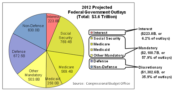
This graph breaks down federal spending into three main categories, as shown by the yellowish, reddish, and bluish wedges:
In this year’s electoral politicking, it appears that both sides are either largely ignoring this reality, or blaming it on current and past congressional or administration inattention and mismanagement – I hope that statement pretty much covers the waterfront. Presenting information clearly does not mean taking a position on policy. This pie chart lays out what is really the central federal policy issue, and I hope I’ve shown that a clear, thoughtful presentation of even a numbers-laden, apparently complex issue can be both comprehensible and complete. But the only way to get this kind of clarity from your candidates is to demand it of them. . . all of them.
“Painting with Numbers” is my effort to get people talking about financial statements and other numbers in ways that we can all understand. I welcome your interest and your feedback.
This graph breaks down federal spending into three main categories, as shown by the yellowish, reddish, and bluish wedges:
- Mandatory spending, on social programs where the amounts spent are set by law
- Interest on the debt owed by the U.S. government
- Discretionary spending, on defense and other, non-defense, government activities, like State, Interior, Agriculture, Education, etc.
As you know, Uncle Sam must pay the interest on the debt. And the amount we spend on mandatory programs is set by existing law and driven by demographic realities and economic conditions. Only discretionary spending is touched by the annual appropriations process.
I usually dislike pie charts – they provide too little information while at the same time taking up too much space and being hard to interpret – but this one tells a powerful story, and it’s this: Only about one-third of today’s federal government expenditures can be controlled in the near term. Without enacting new laws, the rest of the spending is on auto-pilot. This makes controlling federal expenditures especially challenging. Moreover, for reasons that the government can’t control without changing the law, and that aren’t much eased by improving economic conditions, the trends in mandatory expenditures and interest on the debt will be relentlessly upward (we’ll talk more about that in future posts).In this year’s electoral politicking, it appears that both sides are either largely ignoring this reality, or blaming it on current and past congressional or administration inattention and mismanagement – I hope that statement pretty much covers the waterfront. Presenting information clearly does not mean taking a position on policy. This pie chart lays out what is really the central federal policy issue, and I hope I’ve shown that a clear, thoughtful presentation of even a numbers-laden, apparently complex issue can be both comprehensible and complete. But the only way to get this kind of clarity from your candidates is to demand it of them. . . all of them.
“Painting with Numbers” is my effort to get people talking about financial statements and other numbers in ways that we can all understand. I welcome your interest and your feedback.
Related Blogs
Other Topics
Other Topics