

At Last! A Pie Chart That Actually Says Something Important!
Jan 30, 2017
Please! Forward this blog to every friend and colleague who cares about U.S. public policy. Consider it your civic duty to share critical information about how your tax dollars are spent! Oh, and there’s an important lesson here about data visualization. (And for the next blog in this short series, click here.)
You know how much I hate pie charts – in my book, Painting with Numbers, using a pie chart is Deadly Sin #10. But occasionally – very occasionally – a pie chart tells an important story. Current federal government spending is such an example – let’s learn something about federal spending AND get some insight into the ugly, the bad, and the good of data visualization.
We begin with the BAD (and therefore UGLY), a pie chart from a Wikipedia article on government spending:

From this graph, it’s easy to see that Healthcare and Social Security each consume about one-fourth of federal spending and together account for one-half of a $3.7 trillion budget. That’s a lot (he said mildly). Beyond that, other than the numbers that you can read off from the data labels, there is no information in this pie chart. (As a test of this assertion, look at the above graph for a while. Concentrate. Then turn away and try to recall what you’ve learned. You’ll be surprised at how little you learned.)
Now for the GOOD. Here’s my own version of this information:
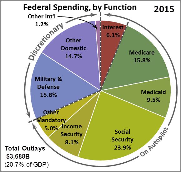
Please note the following characteristics of this infographic, all of which are closely tied to the most important messages this content should be delivering:
- Color scheme. The federal budget is frequently broken out into three main spending categories: (a) mandatory, which Congress can only change by passing new laws, (b) discretionary, which Congress controls through the annual appropriations process, and (c) interest on the national debt, which Uncle Sam must pay. My chart makes these policy distinctions clear with distinctive colors: greenish for mandatory expenses, bluish for discretionary, and reddish for interest.
- Data ordering. The mandatory, as well as the discretionary, data points must be visually grouped together for the reader to get a sense of the TOTAL spending in each of the three main categories. The Wikipedia chart fails to do that – in particular, the “Other Mandatory” data point is separated from the other two mandatory elements (Healthcare and Social Security). You must be careful about how you order the spreadsheet data that creates your graphs.
- Added artwork. To drive home the key point – namely, that less than one-third of the federal budget can be controlled by congressional appropriations – I’ve added artwork to further discriminate between the discretionary spending and the rest of the federal outlays, as well as dark broken lines to demarcate the three main spending categories.
- More data points. Points (1) and (2) above enable the graph to tolerate several more data points without rendering it completely unreadable. I’ve taken advantage of this to break Healthcare into Medicare and Medicaid – each is a huge item – and to break non-defense discretionary spending into domestic and international components – many people are surprised to learn that international discretionary spending, which includes all foreign aid, comprises such a tiny share of the federal budget.
We now have a pie chart that not only gives us a clear overall picture of federal spending, it highlights the single biggest issue: that a huge share of our federal budget goes to spending items that can’t be easily controlled. As our population ages and healthcare gets more expensive, Social Security, Medicare, and Medicaid will continue to grow dramatically. And as the government’s debt grows and interest rates rise, so will Uncle Sam’s interest expense.
Moreover, this example highlights the one case where pie charts are cognitively effective – when you’re comparing the sum of several components. For example, a company that offers a large portfolio of products, some to the consumer market and others to the industrial market, might want to use a pie chart to show a fair amount of product detail, but distinguish the total revenues of its consumer products from the total for its industrial products.
“Painting with Numbers” is my effort to get people to focus on making numbers understandable. I welcome your feedback and your favorite examples. Follow me on twitter at @RandallBolten.Other Topics