

The U.S. House of Reps, and Data Visualization (#2)
Nov 17, 2014
I’m including this post in the series because of the extremely insightful suggestions offered by my new friend, Hicham Bou Habib, on LinkedIn’s Certified Corporate FP&A Professionals group discussion thread. Here is a revision to the graph I posted last week (click here to view the original); I followed many of his suggestions:
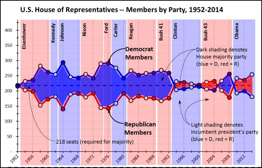
The changes, which will seem minor at first glance, add significantly to the graph’s readability; they include:
We now have a graph that is (I hope) easy to read and, in a single visual, presents the following types of data:
“Painting with Numbers” is my effort to get people to focus on making numbers understandable. I welcome your feedback and your favorite examples. Follow me on twitter at @RandallBolten.
The changes, which will seem minor at first glance, add significantly to the graph’s readability; they include:
- Different markers for mid-term years (white circles) vs. presidential-election years (filled circles), drawing a further distinction between these two types of elections
- Removed the legend from the bottom of the graph, using instead text and arrows to point out the features on the graph itself. (This minimizes the reader’s eye movement and allows more room for the graph itself.)
- Added similar text and arrows to describe the meaning of the shading, both for the House majority (dark shading between series lines) and in the president’s party (light background shading)
- Thicker lines for the Democrat and Republican series lines, fainter lines for the horizontal and vertical gridlines, and axis labels in plain text instead of boldface. (All of these changes help to increase the “data-ink ratio,” to use the terminology introduced by Edward Tufte.)
We now have a graph that is (I hope) easy to read and, in a single visual, presents the following types of data:
- Democratic membership in the house, and its progression over time
- Republican membership, ditto
- The identity of the House majority party
- The size of the House majority
- Presidential-election years vs. mid-term election years
- The incumbent president’s name
- The incumbent president’s political party
- As I said earlier, this effort has been extremely time-consuming
- Opportunities to present this much different data in a single, reasonably comprehensible graph don’t come up that often
- And most important, does the graph answer the question we set out to answer in the first place?
“Painting with Numbers” is my effort to get people to focus on making numbers understandable. I welcome your feedback and your favorite examples. Follow me on twitter at @RandallBolten.
Related Blogs
Other Topics
Other Topics