

The U.S. House of Reps, and Data Visualization (#1)
Nov 10, 2014
At last week’s terrific Association for Financial Professionals (AFP) national conference, there was much discussion of “data visualization,” a major information-presentation buzzword these days. Last week’s U.S. elections seem to provoke the same urges to barrage us with graphics. But do all these beautiful pictures really get us anywhere?
These thoughts were brought home by a Washington Post piece attempting to form conclusions about how the U.S. president’s party has fared in the House of Representatives in mid-term elections since 1952 (click here to see it). Unfortunately, The Post’s effort is nothing more than a pile of data fragments separated by slick visuals and lots of white space, which combine to rob the reader of any sense of the scale of the changes or of any discernible trend or pattern.
So I decided to take my own data visualization stab at the political party composition of the House:
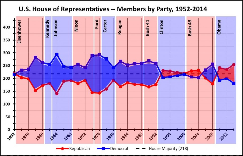
I consider this a big improvement. In a single image, the reader can see the House’s composition over the entire 1952-2014 period (31 election cycles), and at the same time get a sense of scale, trends, and patterns. The following characteristics help:
I believe the answer to the above questions is: sometimes, but not nearly as often as many think. More on this in my next post.
“Painting with Numbers” is my effort to get people to focus on making numbers understandable. I welcome your feedback and your favorite examples. Follow me on twitter at @RandallBolten.
These thoughts were brought home by a Washington Post piece attempting to form conclusions about how the U.S. president’s party has fared in the House of Representatives in mid-term elections since 1952 (click here to see it). Unfortunately, The Post’s effort is nothing more than a pile of data fragments separated by slick visuals and lots of white space, which combine to rob the reader of any sense of the scale of the changes or of any discernible trend or pattern.
So I decided to take my own data visualization stab at the political party composition of the House:
I consider this a big improvement. In a single image, the reader can see the House’s composition over the entire 1952-2014 period (31 election cycles), and at the same time get a sense of scale, trends, and patterns. The following characteristics help:
- The graph makes full use of the blue/red characterization of Democrat/Republican leanings, which became universal around 2000.
- The color of the shading between the series lines for each party identifies the majority party and conveys a sense of the size of that majority and its trend.
- Text and background shading – again blue or red, but fainter colors – identify the incumbent president and his political party.
- The vertical axis scale runs from 0 to 435, the total number of seats in the House. This gives the reader a truer sense of the scale of the majority party’s edge, as well as the significance of any trends. For example, a ten-seat swing may seem significant, but it’s only 2% of the House membership
- The broken line at 218 – the number of seats required for a majority in the House – provides an additional sense of the relative difference between parties.
- The vertical gridlines and horizontal axis text distinguish presidential-year elections from mid-term elections. (Much punditry revolves around the meaning of mid-term election results.)
I believe the answer to the above questions is: sometimes, but not nearly as often as many think. More on this in my next post.
“Painting with Numbers” is my effort to get people to focus on making numbers understandable. I welcome your feedback and your favorite examples. Follow me on twitter at @RandallBolten.
Related Blogs
Other Topics
Other Topics